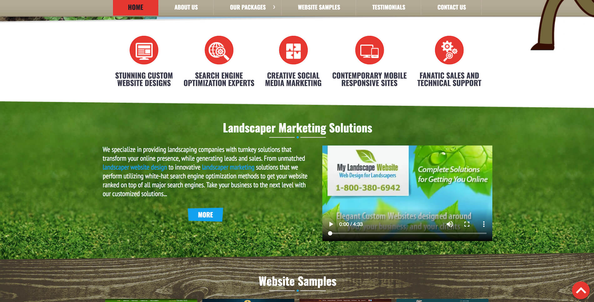
Landscaping website design examples
Luckily it is not a question anymore whether you should have a website for your business. However, having a website is not enough, a website should be visually attractive, user friendly and it should work, meaning that it should bring more clients to your business and visitors should be able to find information that they are looking for on your website.
As an owner of a landscaping business you probably have plenty of things on your plate and do not have as much time to research about how a decent, beautiful and most importantly website that attracts new customers should look like. Thus, our team made a research and chose 5 landscaping website designs to showcase in this article. We will discuss dos and don’ts with a landscaping website design. Hopefully this information will help you to make a right decision and give you more clarity on how a good landscaping website should look like. So without further ado, let’s talk about the landscaping website designs.
Mariani Landscape
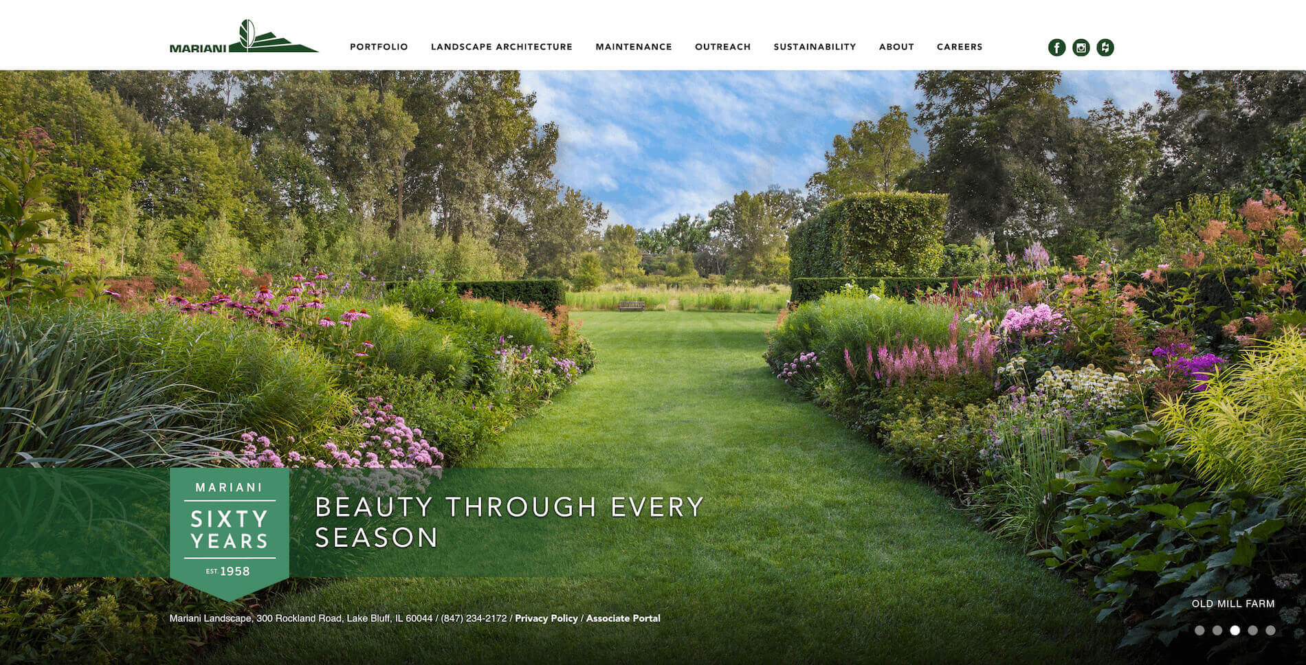
Mariani Landscape‘s website is very simple and clean yet elegant and well-formed. Home page (a main page on the website) is represented by a slider with photos.
The rotation of images on the slider allows to showcase best landscaping works to visitors of the website. It is always a good idea to use your own professionally made photos instead of stock images. Also, the second most important content of the website after the portfolio is a contact information and Mariani Landscape took this into consideration and displayed their address and phone number on the home page.
Good: slider with photos of their landscaping work; contact information.
Things to consider for improvement: the font size of the contact information is too small and might be hard to read for some users.
Cutting Edge Landscape
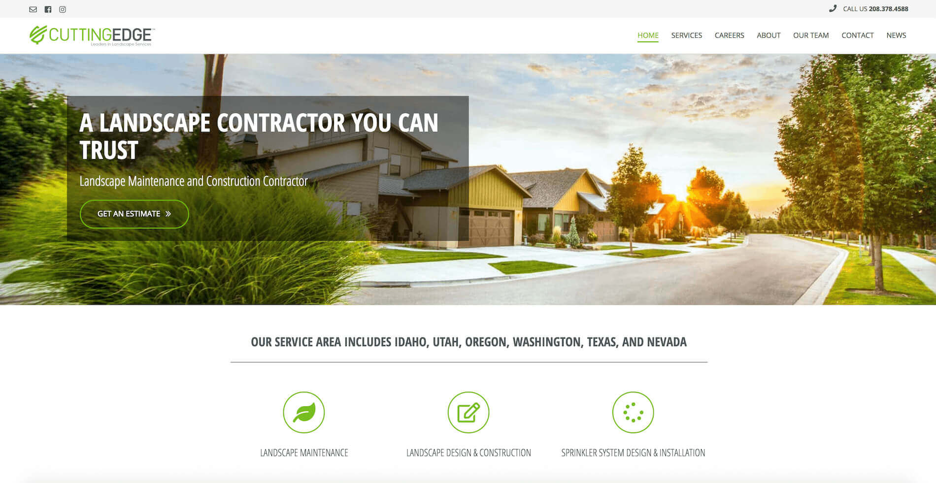
Cutting Edge Landscape. The website has eye appealing colours. It is very important not just select beautiful colour palette for your website but also to make sure they play together well, and Cutting Edge Landscape absolutely did a great job here. The website has a team section that displays photos of key people of their landscaping business.
These days it is very important to show who is behind the scenes of your business as it brings level of trust to your current and potential clients.
Good: great colours, team section.
Things to consider for improvement: a video that is in autoplay mode is a risky move, usually it is a good idea to let user decide when to play a video and give them the right to hit the play button when they want to do so.
Bright View
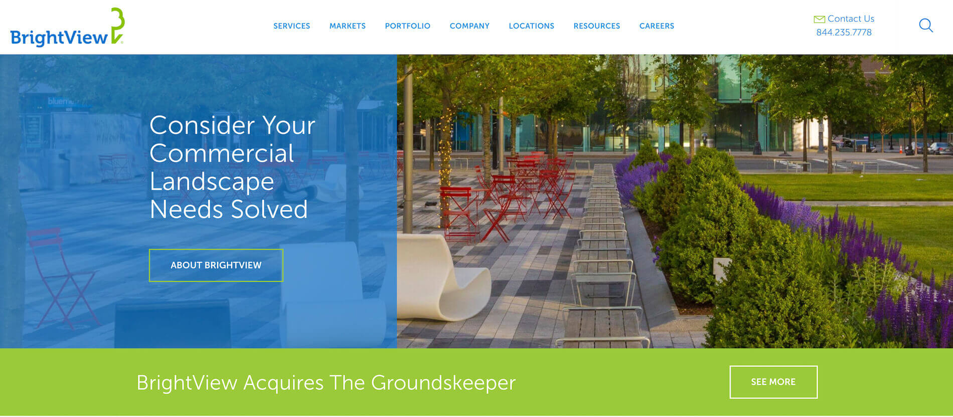
Bright View Landscape knows how to use ‘Call to action’ feature. They have big buttons with large font size. Buttons like these make it very tempting for a website user to click on those buttons. Website design and usability is very important feature of any website and Bright View website design achieved this goal.
Good: good navigation.
Things to consider for improvement: a font size in the footer is hard to read because is too small and the position of the elements can be changed.
Lynch Landscaping
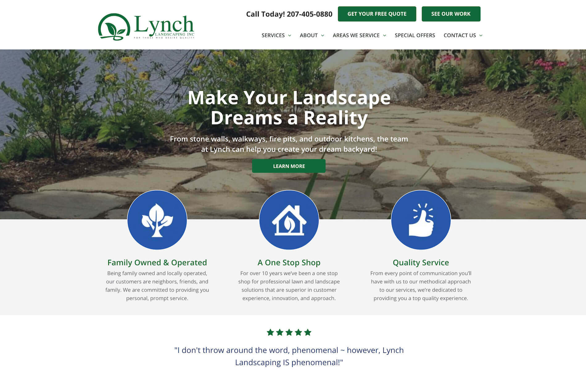
Lynch Landscaping have a map on their website that is not only a good for potential client to find where their business is located but also is great for local SEO. It increases website’s ranking in search engines such as Google, thus helps potential clients to find their business online and eventually bring more customers.
Good: google map on the home page.
Things to consider for improvement: a google map is slightly small, would be good to make it full width of the page. A video that is in autoplay mode is a risky move, usually it is a good idea to let user decide when to play a video and give them the right to hit the play button when they want to do so.
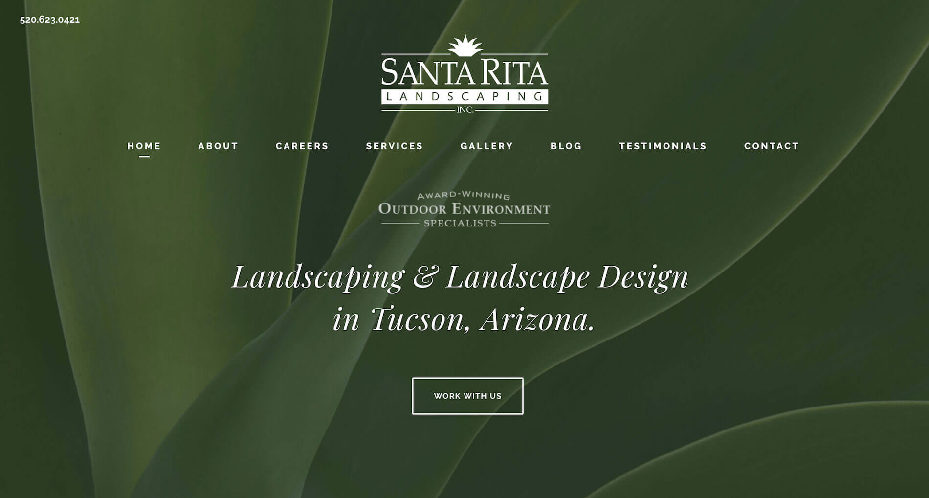
Santa Rita Landscaping
Santa Rita Landscaping is one of not many landscaping websites that uses animation. The animation can bring an attractiveness to a website as well as highlight the most important information.
Good: animation, hover effects, scroll to top button, client’s testimonial section.
Things to consider for improvement: without any doubt a contact form is a great feature to have on the landscaping website but on this website the width of the form looks too small on the desktop screen.
Landscaping website design rules
Fast loading
Your website should load fast. You might ask what this has to do with a landscaping website design? However a speed of the website’s loading shows the quality of the website and impacts how long user and potential client will stay on the website.
Some people can get too excited about graphic experiments and forget to pay attention to the website’s loading speed. Unfortunately, the website speed can drastically decrease if it contains plenty of animations, videos and widgets. If your website loads slow users can lose their patience and they will simply leave your website without having a chance to review it and find useful information.
On the other side, the website will look empty and boring without graphic designs. No one is going to read a long boring text. The main idea is to keep a middle ground. Great visuals are absolutely a necessity but ask your designer to keep it simple. Also keep in mind that your website should be on a good hosting service, loading speed of your website highly depends on the quality of your hosting provider.
Usability
Your landscaping website can be beautiful and modern but at the same time it can be useless if users do not know how to use it or find necessary information. Usability means how easy and fast users can navigate your website and find what they are looking for. For instance, a user goes to a home page of your website and reads a short headline, this short paragraph should give a clear understanding what is the purpose of the website, what business or service it represents.
Main menu should have a clear navigation. For instance services, products, about and link to contact information. There is a famous rule of three clicks, which claims that user should be able to get to any needed information on your website within maximum of three clicks or less. For example if a user wants to find a specific product on your website, they should be able to do it in three clicks. If user needs to perform more than three clicks, it means that there is something wrong with usability of the website and it should be fixed.

Fonts that people can actually read
Back in the days it was trendy to use intricate fonts. Sometimes letters were so curly that people could not read the actual text. Also it was popular to use controversial colours on the fonts. These days trends luckily have changed. If the font is easy to read and comprehend it means that it is a good font. To get a good feel of good usage of fonts on the website, visit websites of famous brands. They use large and clean fonts that even a toddler can read. Why? Because it is easy.
Another rule that concerns fonts is that there should be no more than 2-3 different fonts per a website and landscaping websites are not an exception. If there are more than that it means you are doing something wrong and it is a sign of a bad taste. For instance the acceptable usage of different fonts would be: one font for headings, another font for paragraphs and maybe separate font for a logo.
Working on your landscaping website design you can work closely with the designer and create a brand book. This brand book will contain fonts that are going to be used across your website, thus your designer will stick only to those fonts. Even if you decide to change a designer over some time period, you can show your brand book to a new designer, thus maintaining the fonts consistency.
Not only that the website that has a bunch of different fonts won’t look any good, it will also impact the loading speed of your pages and you might also run into font compatibility issues.

Colour scheme
The same rule of three applies to colours scheme, meaning that it is a bad practice to use more than 3 colours on single page on the landscaping website. If you have to many colours variations on your landscaping website, you potentially risking that your client will not notice the most important information on your website.
It is also a good idea to have your colour scheme in your brand book. You and your designer should come up with corporate colours that will represent your company and your brand. Same colours will be also used for other marketing purposes, such as in your social networks, brochures, print materials, etc.

Modern background
You have to be very careful with picking a background on your website. Even though usage of a background image of one of your landscape design might seem like a good idea at first, watch out not to end with the design of the website from the 90th. It can be too obvious and trivial.
Keeping everything consistent
Strict fonts, amusing colours and stock images from all over the place is a sign of a bad taste design. More doesn’t mean better.
Grid system
Experienced designer very well knows how grid system works. For instance each page is divided on three equal parts (rows) vertically and horizontally. The most eye catching sections on the website are spots where these imaginary lines intersect.

Scroll to top button
Very useful and often omitted button on the website. Landscaping websites tend to have lots of images with photos that represent their landscaping work. Users of the landscaping websites can scroll down to the page to see all works that you have displayed for them. Scroll to top button or icon can be very useful to bring user back to the top of the page within one click.
Visualization
Landscaping website design is all about showcasing your work. Thus don’t be afraid to showcase to do this. At the end of the day your portfolio is a major factor for a potential client to make a final decision to hire you or not for a landscaping project that they need.
Responsive design
Last but not least is a responsive design. Landscaping website design should be a responsive website. Meaning that the website should look good on different devices, such as desktop, tablet and mobile.

Landscaping website design hints
For most people home is a special place. Thus, most of us want to make it look beautiful and comfy. A lot of people agree with this adea and that is why they spend lots of their precious time, efforts and money to make their homes cozy and elegant.
Moreover, these days people spend more time thinking about landscape design ideas because homeowners suppose that exterior design of the house is as important as interior design. Thus, it is not a big surprise that talented landscape designers are in high demand.
Landscape design is an art that requires set of skills and a talent. As a professional landscape designer you should know a lot not just about the design but also about cultivation of various plants. However, if you are just starting in this field even this knowledge will not guarantee a success in the landscaping business.
You will have to spend plenty of time searching for your potential clients. In this case your personal website plays a huge role. Despite the fact that you might be a great landscape designer you might not know enough about website design and development. There are few things that you can do to create a website for your landscaping business.
You can use a website builder tool online and create your own website yourself or you can hire a professional agency to help you with this task.
No matter what path you choose we want to point on key notes that you should take in consideration when creating a landscaping website.
First of all remember that a professional website design is a best mean of advertising for your landscaping business. Visitors of your website expect to see something spectacular on the landscaping design website. So if you want to satisfy the expectations of you clients or even exceed those expectations you should follow the following principles:
1) Grid Layout design
Your main goal is to keep clients on your website and not to overwhelm them with excessive information and not to distract them from the most important things on the website. To achieve this goal you should stick to a grid layout by kipping elements evenly arranged on the website. Centering is the easiest way to get symmetrically balanced page.
2) Determine the key accent
Make a decision which element is the most important on the page and highlight it. Maybe there are few key elements on the page, however you should keep in mind that by keeping and highlighting multiple elements on the page, the desired result may not be achieved. Thus, focus on one major element to achieve best results. Make an accent on the most important things using the following techniques:
– text : change the font size, use bold and large fonts as well as unusual colours to highlight an important element;
– background image: a background images considers to be the most powerful visual element so use it wisely. Pick large, good quality photo to use it as a background image on your landscaping website as well as add a brief paragraph of text that describes best your services;
– beautiful images and galleries also make a good impression on your clients and website visitors. Upload photos of your landscape designs that are made by a professional photographer. Thus, on top of creating website you make a good advertising campaign for your landscaping business;
– colours: use variations of bright and contrast colours. This method is very effective if you apply it to a background image and a text by keeping them in contrast. This technique also can be used on main heading;
– unusual forms: you can play with different variations of the forms that can help you to represent information on your website. The forms can add a fresh and interesting look to your website but you should be careful with using various forms as you want to keep a harmonious look on your website;
– visual effects and animation: another great idea how to make your landscaping website look astonishing, is to add a clean animation to it. Modern technologies and browsers support a lot of cool animations. Such as hover effects over images, parallax effect, text zoom on hover and click can make a big difference if used wisely. But don’t overload users with these effects and animations. Overuse of such things can cause more harm than good;
– video: uploading video to your website can make a great impact if it contains useful information and explains your service in better depth as well as showcase your best works. However, you should be very careful with placing video on the website. Especially it concerns videos that are in autoplay mode and start playing without users’ approval. Videos that have sound on should never start playing on your website without user’s approval. This can lead to user’s frustration and they will imidiately leave your website. Let your users and potential clients decide what video they want to play on the website and give them the right to control it.